Bespoke Font for S.A:M
The Task: Thomas Mertens is a system caterer who fills deficiencies in the marked of food showcases. With his patented know-how and a high quality technical nature. For this purpose a corporate font focused on B2B communication is developed, that – with a vision into the franchise-future – transmits the brands essence.
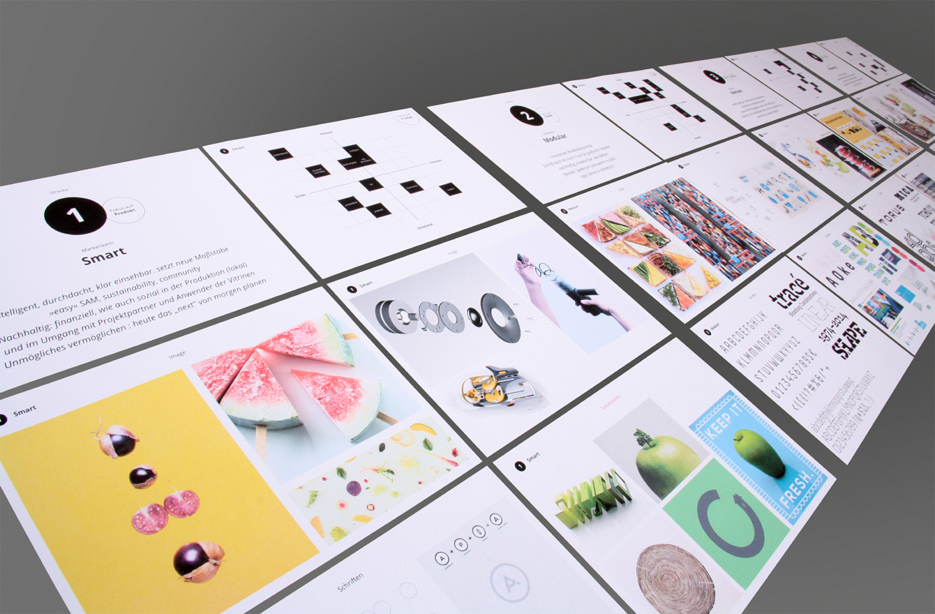
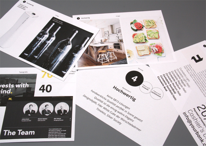
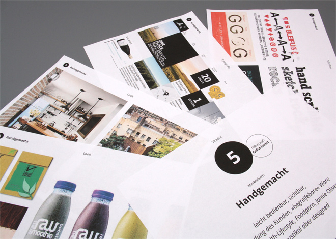
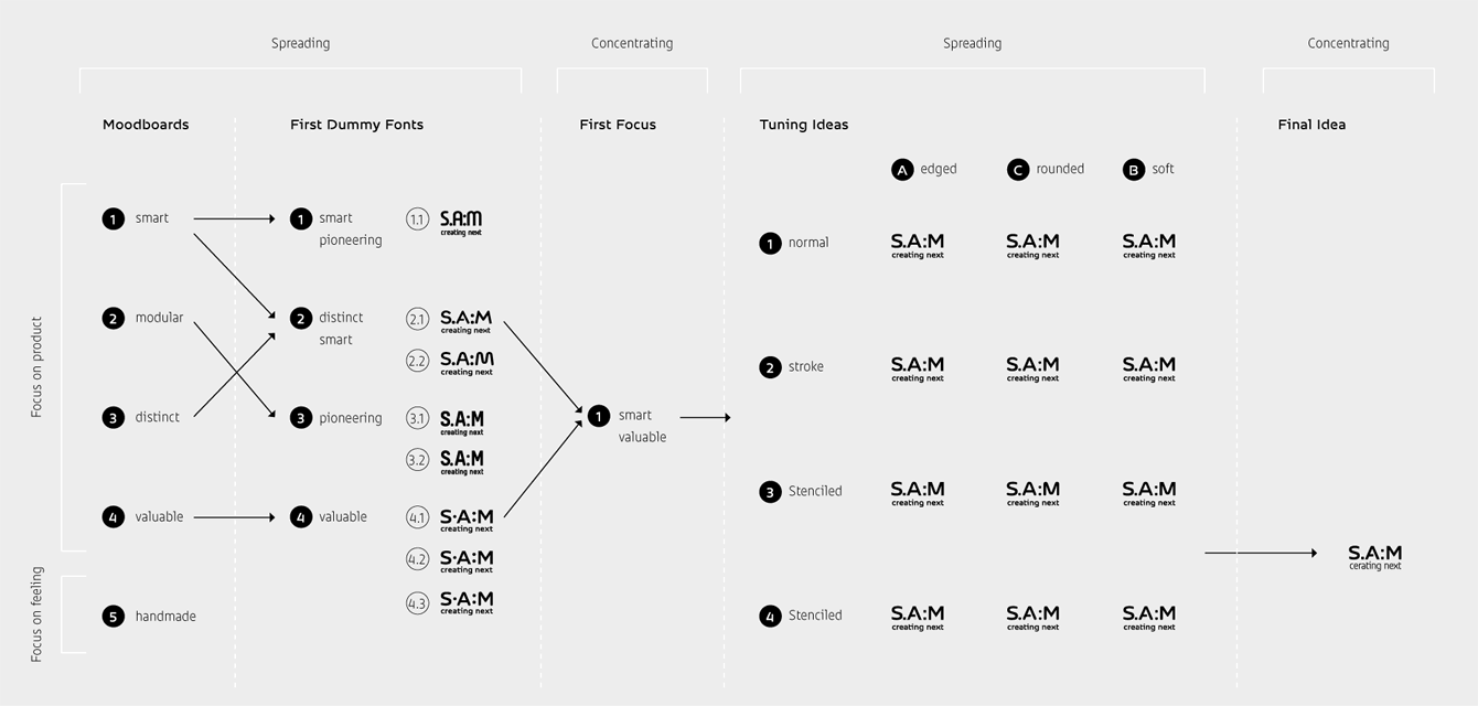
The Process: The decision for a custom font was made even before a concrete corporate design was developed. This lead to define which brand characteristics are supposed to be translated into the visual appearance of the typeface. Whether intelligent ingenuity, redefined norms, innovative modular concepts, self-assured distinctiveness, technical quality or handmade character – at first options of positioning are visually were presented to the client.
Through extensive moodboards substantive orientations were systematically scanned, yet detached from the idea of a later typeface. By finally focusing on attributes such as smart, modular, high-quality and future-oriented, the first test-fonts were developed to visualize the brand values of the company in many different ways .
Conclusively, small changes in detail brought final tuning to the identification though the corporate typeface.
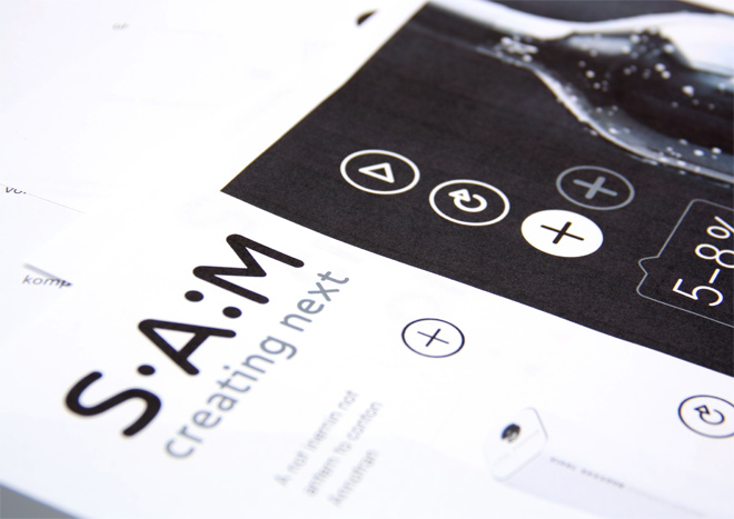
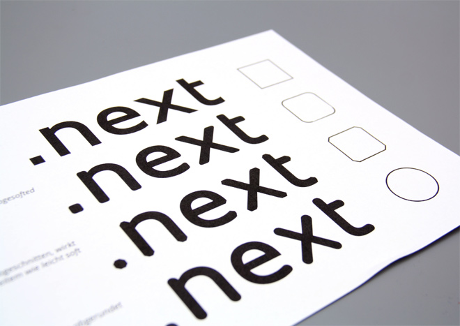
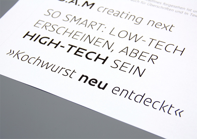
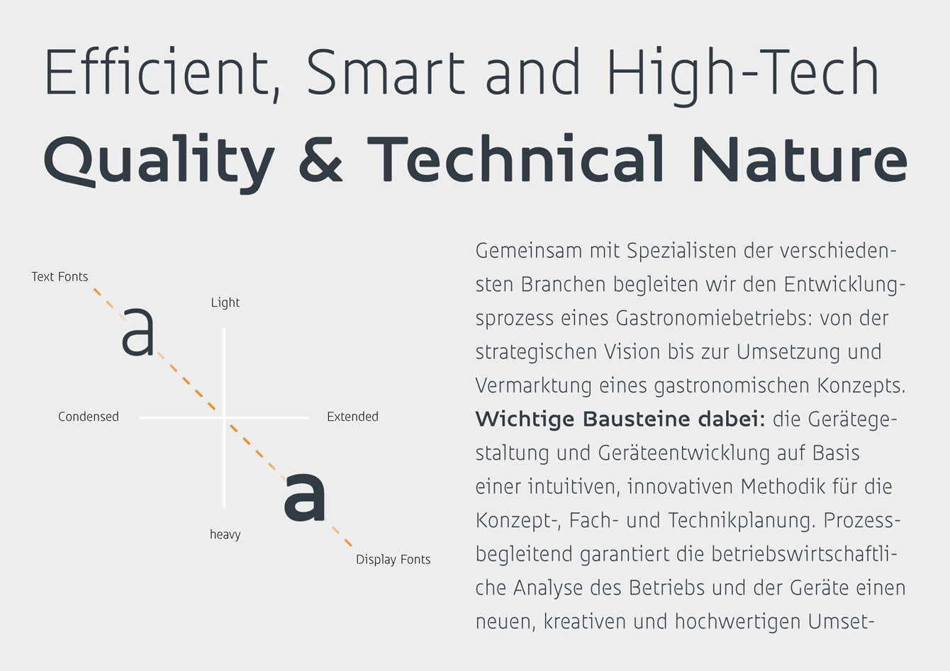
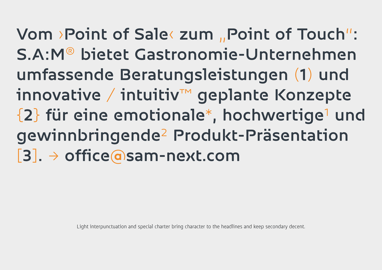
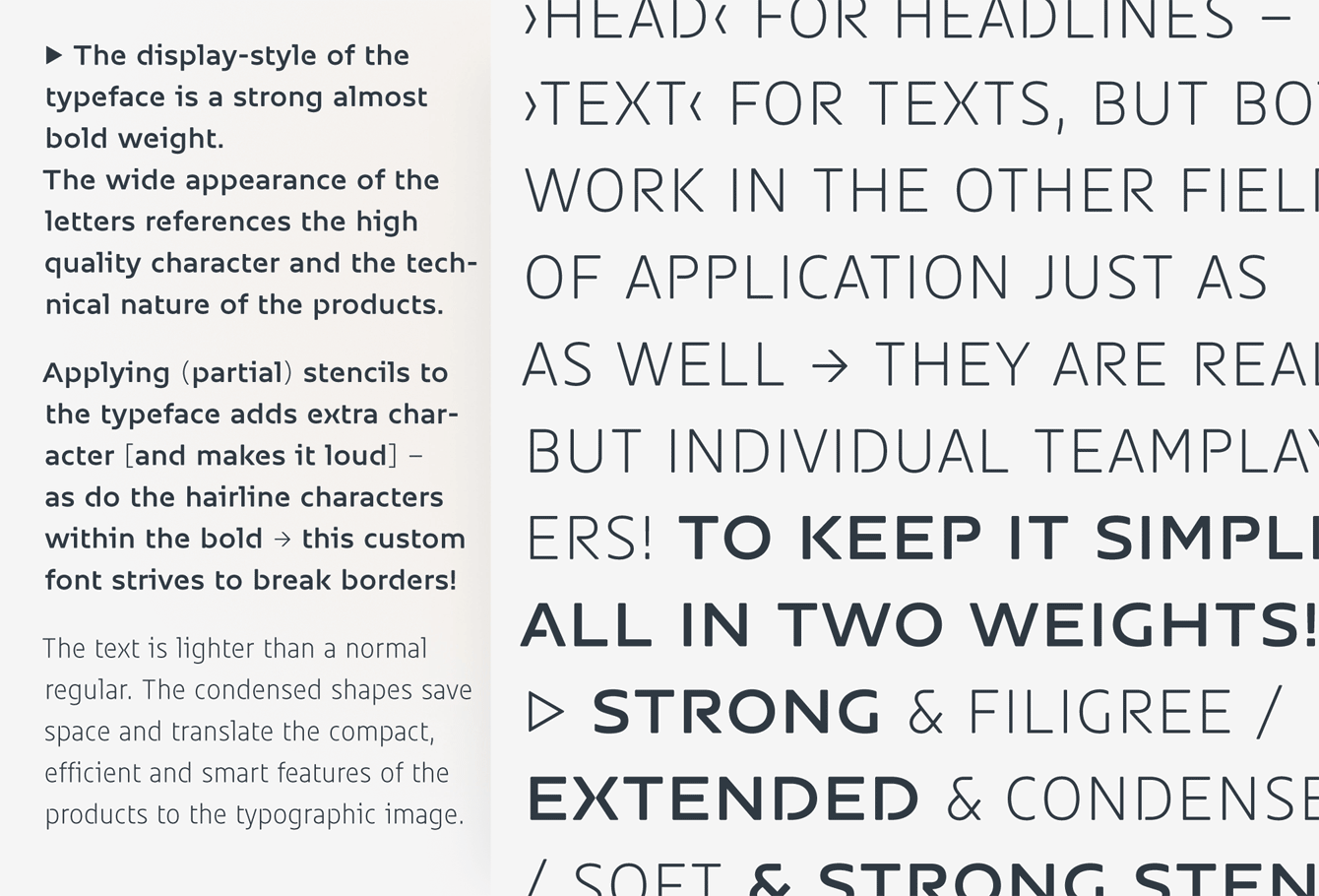
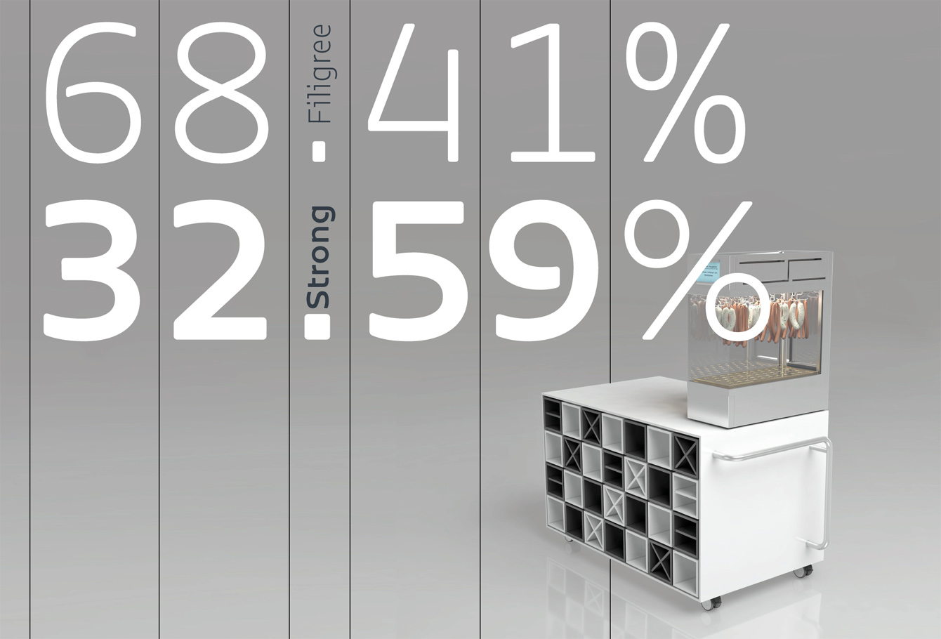
The Result: This resulted into a highly economic font with only two weights. The spectrum covers Light to Bold and Condensed to Extended. Hereby the product characteristics of S.A:M® are reflected. The display style of the typeface is a strong almost bold weight. The wide appearance of the letters references the high quality character and the technical nature of the products. In contrast, the text style is light and narrow, condensed shapes save space and translate the compact, efficient and smart features of the products to the typographic image.
Both styles are planned to work in combination: whether in small text or in headers, the spectrum of customers product is fully visualised by only two styles.
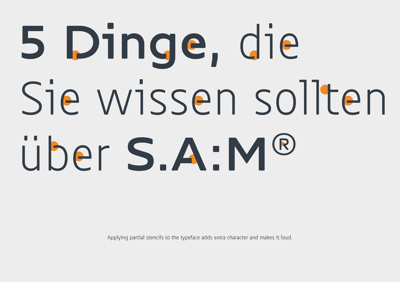
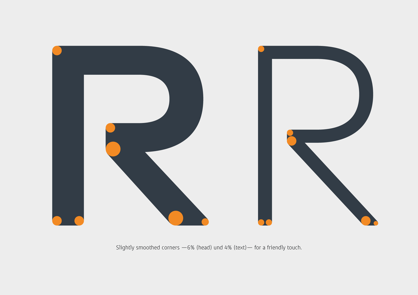
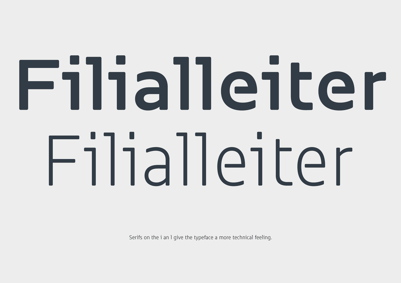
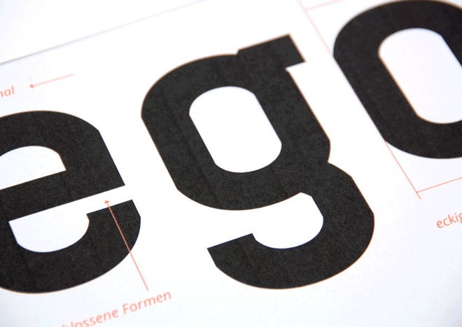
In large point sizes the partial stencils, applied to some characters, become visible and add extra character and strengthen the value of recognition. The hairline punctuation within the bold head style breaks known patterns and produces distinctiveness and individuality that too characterizes S.A:M® as an innovative thinker.
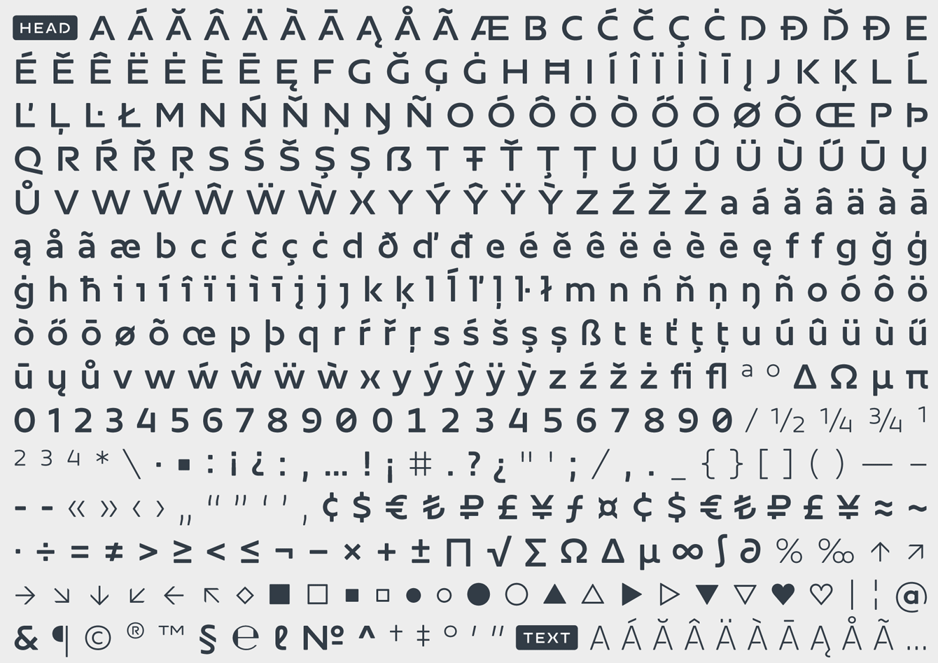
With a wide language coverage SAM Text and SAM Head are ready for European markets. The Desktop and Web Fonts with optimized screen performance contain useful icons, superscript figures plus fractions, tabular figures with a mono-width across all weights, as well as contextual auto corrections to simplify the daily work with the fonts.